An Identity Shift
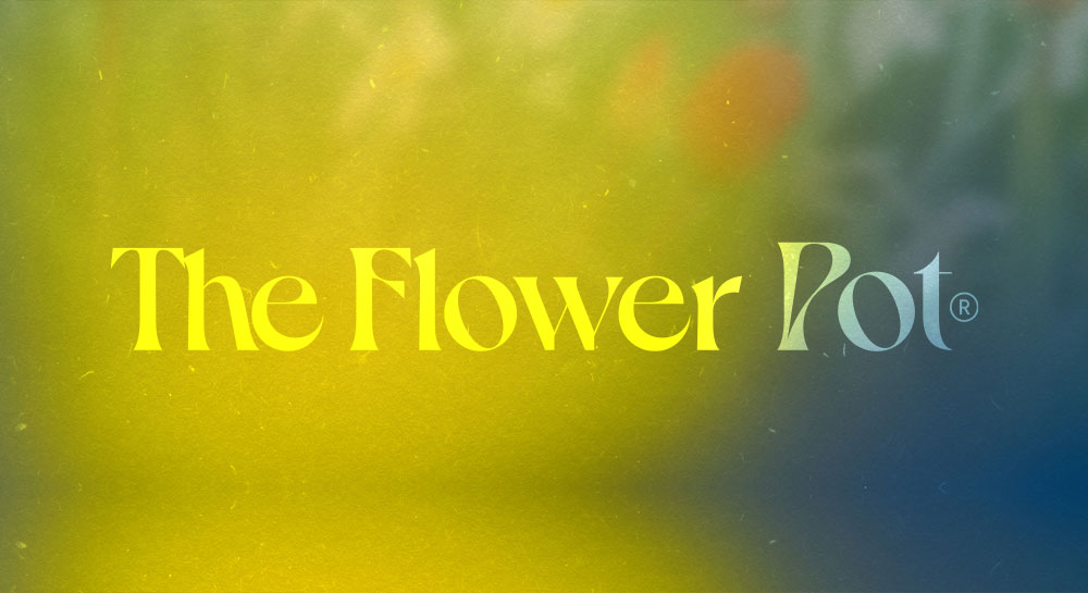
New goods, new concept, new look. We're introducing the new logo to match our fresh feel. We've collaborated with the esteemed design team at @outfit_branding, the very creators of our original iconic icon, who have once again dazzled. Here's a note from their founder, Larry Nguyen on their creative conceptualization.
"The iconmark itself is the most explicitly Art Nouveau-inspired, evolving the original logo into a more fluid, organic shape that feels somehow both animalistic and floral. We included small details like a unique ink trap in the apex of the leaves, and monstera-like, curved bases.
For the wordmark, we looked for something that could convey the artful, idiosyncratic soul of the brand, while still exuding a sense of urbane grace and style. We found this heady combination in a typeface from renowned foundry VJ-Type called Dahlia, a beautiful, Art Nouveau-tinged type that embodies the perfect balance between eccentricity and delicacy. Nonconformist, romantic...its atypical curves and refined details create a lot of rhythm and timeless elegance.
This aligned so well with The Flower Pot's personality, with its emphasis on artistry and craft. The “P” and “F” in particular are stunning with its sensuous contours echoing the undulating contour of the iconmark."
A look below of our visual evolution.


